Back to Library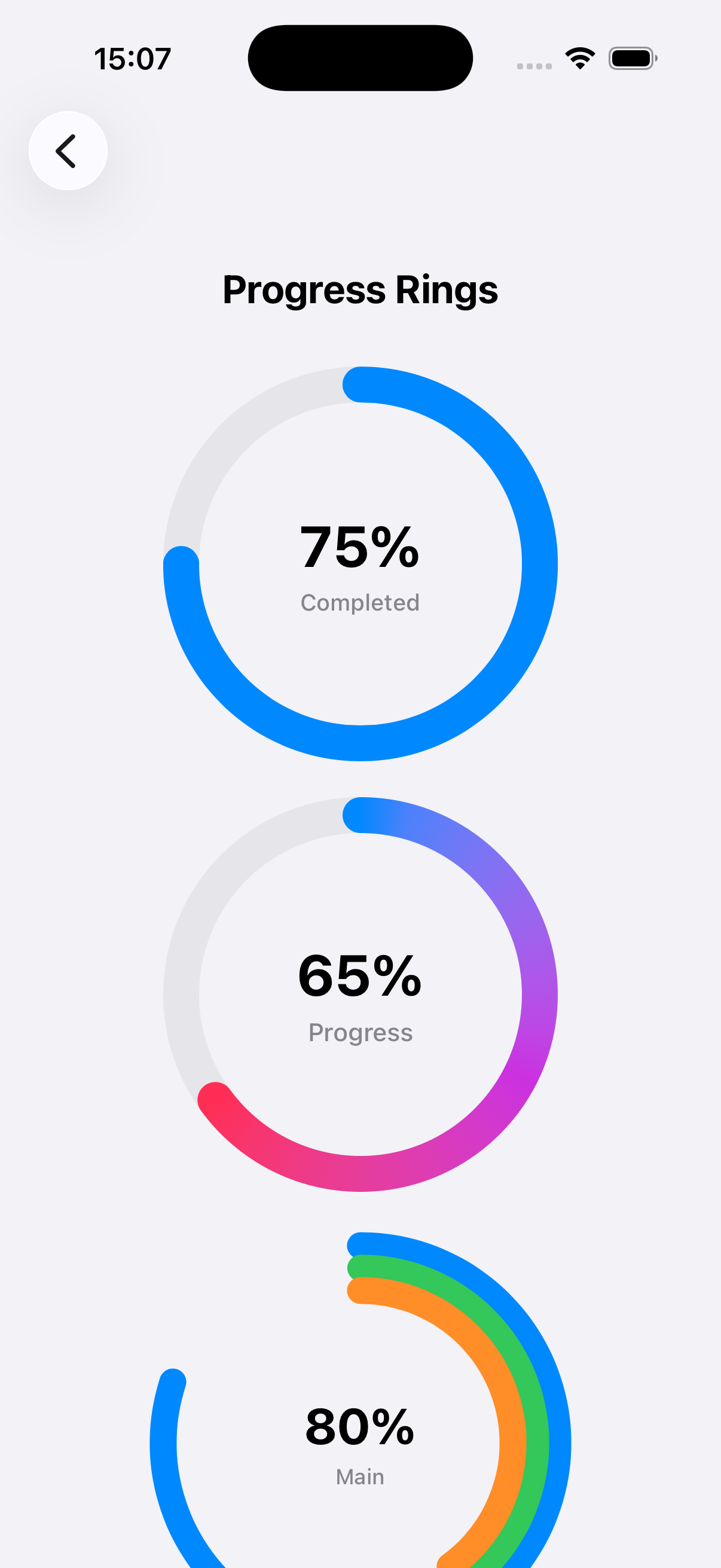
Hover to play
Animated Progress Ring
by Luiz Mello
@luizmellodevprogressringcircularanimationchart
Description
Beautiful circular progress indicators with smooth animations. Includes standard rings, gradient rings, multi-layer rings, segmented rings, and dotted rings. Fully customizable with colors, sizes, line widths, and labels. Perfect for dashboards and progress tracking.
SwiftUI Code
9 files • Scroll to see all →
public struct ProgressRingStyle {
    let lineWidth: CGFloat
    let backgroundColor: Color
    let foregroundColor: Color
    let lineCap: CGLineCap
    let showPercentage: Bool
    let showLabel: Bool
    let fontSize: CGFloat
    let fontWeight: Font.Weight

    public init(
        lineWidth: CGFloat = 20,
        backgroundColor: Color = Color(.systemGray5),
        foregroundColor: Color = .blue,
        lineCap: CGLineCap = .round,
        showPercentage: Bool = true,
        showLabel: Bool = false,
        fontSize: CGFloat = 32,
        fontWeight: Font.Weight = .bold
    ) {

// ... (click "Show full code" to see more)Viewing: ProgressRingStyle.swift•1 of 9